非ガウス雑音解析: Rayleigh と Gaussian-Chi#
このチュートリアルでは、Yamamura (2024) および Yamamoto (2015-2016) の研究に基づく、GWexpy の包括的な非ガウスノイズ解析ツールキットの実装を示します。
目次#
ノイズシミュレーション:非定常ノイズと散乱光ノイズの生成。
レイリー統計:レイリー分布からのずれの検定。
GauCh(修正 KS 検定):高度な非ガウス性の検出。
Student-t 指標:分布の裾の厚さの測定。
データ品質フラグ:拒否区間(veto セグメント)の自動生成。
評価と可視化:ROC 曲線と複合ダッシュボード。
import warnings


import matplotlib.pyplot as plt

from gwexpy.noise import scatter_light_noise, transient_gaussian_noise
from gwexpy.plot.gauch_dashboard import plot_gauch_dashboard
from gwexpy.statistics import to_segments
1. ノイズシミュレーション#
KAGRA の特性評価で用いられる 2 種類の非ガウスノイズモデルをシミュレートします。
モデル I:過渡的ガウスノイズ(グリッチ)。
モデル II:散乱光ノイズ(定常的な非ガウス性)。
duration = 32.0
fs = 1024.0

# Model I: Glitch injection
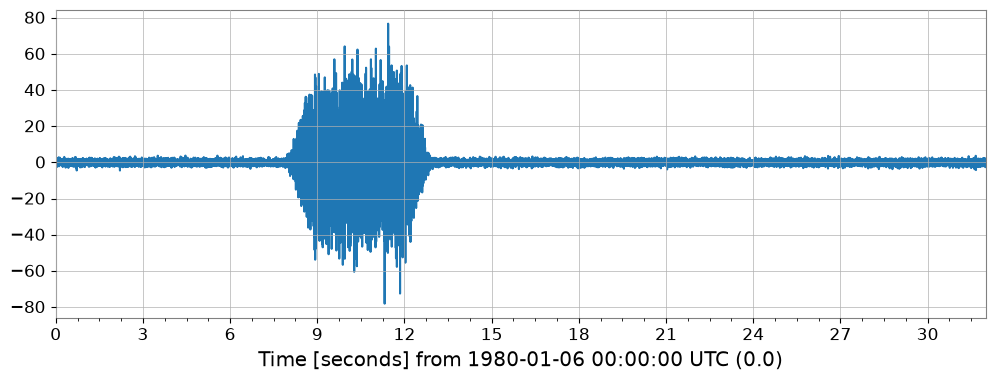
ts_glitch = transient_gaussian_noise(duration, fs, A1=20.0, name='Glitchy Data')

# Model II: Scattered light
ts_scatter = scatter_light_noise(duration, fs, A2=1e-12, name='Scattered Light')

ts_glitch.plot()
2. レイリースペクトログラム#
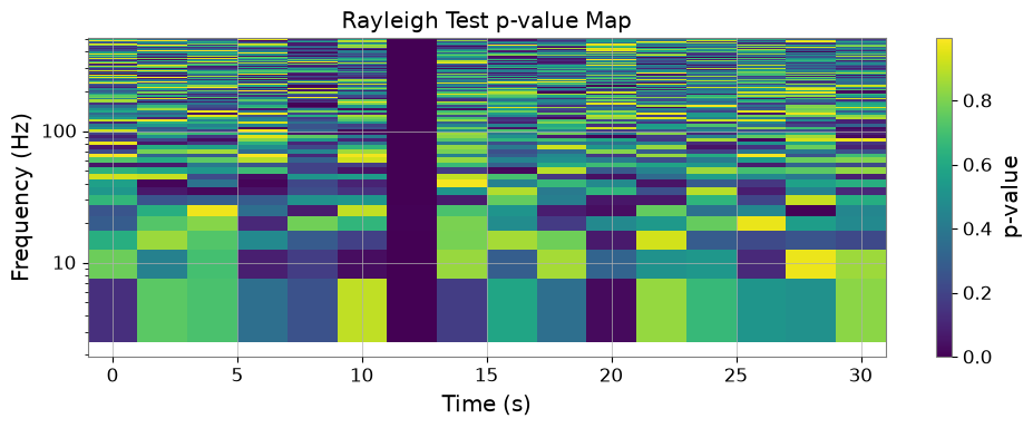
レイリー統計量 \(R\) は、ASD 分布がレイリー分布とどれだけ整合するかを測ります。rayleigh_test メソッドを使って p 値マップを取得します。
Changed in v0.1.12 (#506).
rayleigh_testnow simulates its null distribution from exponential power samples instead of Rayleigh amplitude samples, and derives the number of periodogram segments fromfftlength/stride/overlaprather than accepting a fixedn_samples. Thefftlength/stridebelow were adjusted so that the 20 segments per column this cell always claimed are actually produced -- the previous settings supplied only 2. The DC and Nyquist bins are reported asNaNbecause their power follows chi2_1, not an exponential. p-values from earlier versions are not comparable with these.
v0.1.12 での変更 (#506)。
rayleigh_testの帰無分布は、Rayleigh 振幅標本ではなく指数分布のパワー標本から生成されるようになりました。 ピリオドグラムのセグメント数も、固定のn_samplesではなくfftlength/stride/overlapから導出されます。 下のセルが従来主張していた「1 列あたり 20 セグメント」が実際に得られるようfftlength/strideを調整しました(従来の設定では 2 セグメントしか ありませんでした)。DC と Nyquist ビンのパワーは指数分布ではなく chi2_1 に 従うためNaNとして報告されます。以前のバージョンの p 値とは比較できません。
rs_p = ts_glitch.rayleigh_test(fftlength=0.2, stride=2.0)
fig, ax = plt.subplots(figsize=(10, 4))
mesh = ax.pcolormesh(rs_p.times.value, rs_p.frequencies.value, rs_p.value.T, shading='auto')
ax.set_yscale('log')
ax.set_xlabel('Time (s)')
ax.set_ylabel('Frequency (Hz)')
ax.set_title('Rayleigh Test p-value Map')
plt.colorbar(mappable=mesh, ax=ax, label='p-value')
plt.tight_layout()
/home/runner/work/gwexpy/gwexpy/gwexpy/timeseries/_statistics.py:489: RuntimeWarning: rayleigh_pvalue: DC and Nyquist bin(s) set to NaN p-value (excluded from veto) because their power follows chi2_1, not the Exp(1) used for the null distribution
  return rayleigh_pvalue(rs, n_samples=n_samples, nfft=nfft, **kwargs)
3. GauCh(修正 KS 検定)#
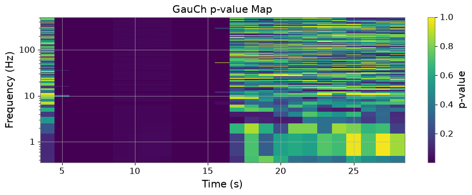
GauCh は、修正コルモゴロフ–スミルノフ検定を用いた、非ガウス性に対するより感度の高い検定です。
gauch_res = ts_glitch.gauch(fftlength=1.0, window=8)
fig, ax = plt.subplots(figsize=(10, 4))
mesh = ax.pcolormesh(gauch_res.pvalue_map.times.value, gauch_res.pvalue_map.frequencies.value, gauch_res.pvalue_map.value.T, shading='auto')
ax.set_yscale('log')
ax.set_xlabel('Time (s)')
ax.set_ylabel('Frequency (Hz)')
ax.set_title('GauCh p-value Map')
plt.colorbar(mappable=mesh, ax=ax, label='p-value')
plt.tight_layout()
4. Student-t 指標#
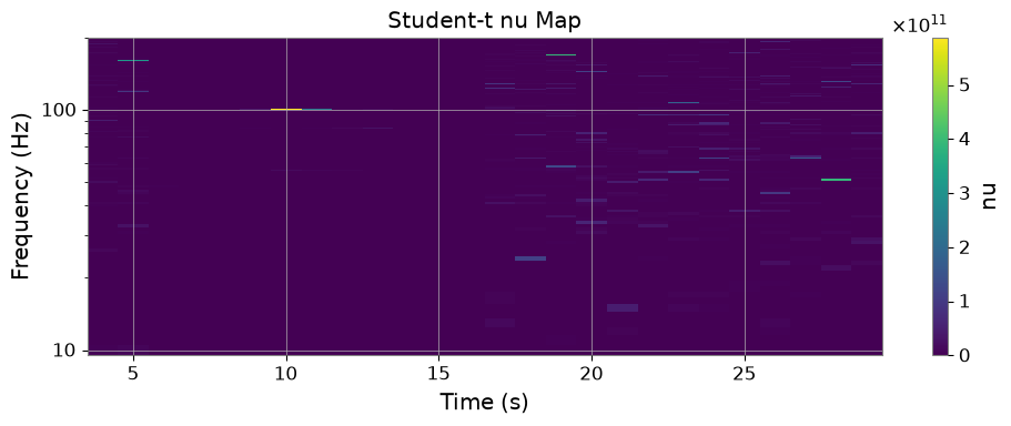
Student-t 指標は、FFT 成分に Student-t 分布をフィットし、自由度 \(\nu\) を出力します。
nu_spec = ts_glitch.student_t_spectrogram(fftlength=1.0, window=8, frange=(10, 200))
fig, ax = plt.subplots(figsize=(10, 4))
mesh = ax.pcolormesh(nu_spec.times.value, nu_spec.frequencies.value, nu_spec.value.T, shading='auto')
ax.set_yscale('log')
ax.set_xlabel('Time (s)')
ax.set_ylabel('Frequency (Hz)')
ax.set_title('Student-t nu Map')
plt.colorbar(mappable=mesh, ax=ax, label='nu')
plt.tight_layout()
5. データ品質フラグ#
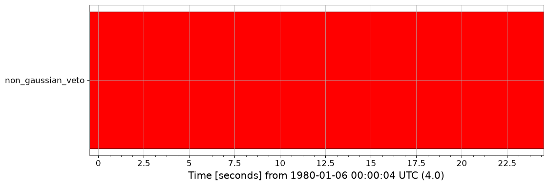
p 値がしきい値を下回る区間を、拒否区間(veto セグメント)として自動生成できます。
dq_flag = to_segments(gauch_res.pvalue_map, alpha=0.001)
print(dq_flag)
dq_flag.plot()
<DataQualityFlag('non_gaussian_veto',
                 known=[[3.5 ... 28.5)]
                 active=[]
                 description='None')>
6. 複合ダッシュボード#
最後に、すべてを単一のダッシュボードで可視化できます。
fig = plot_gauch_dashboard(ts_glitch, gauch_res)
plt.show()